Toggle UI Element
A Toggle UI Element building block is used to Toggle UI element, such as a Toggle button in an already open application window when working with Desktop UI automation. Fully expanded, the Toggle UI Element block shows the following properties:
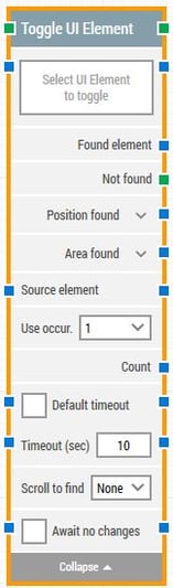
The Block Header (“Toggle UI Element”)
The green input connector in the header is used to trigger the block to start executing.
The green output connector in the header triggers when the UI element has been successfully found.
The title of the block (“Toggle UI Element”) can be changed by double-clicking on it and typing in a new title.
Select UI Element
This property contains the locator for the UI element to be Toggled.
A UI element locator can be captured by clicking on the property and selecting “Capture new element”.
Once set, the UI element locator can be edited by clicking and selecting “Edit element”.
The property can be cleared by right-clicking and selecting “Clear element”.
Found element
This property contains the found UI element in the desktop application window. This can be used as the source element in other building blocks, for instance to narrow down searches for specific UI element such as table cells.
If the element is not found, this property is empty.
Not found
This green output connector triggers if the UI element is not found within the time specified in the timeout field (see below). If no building blocks are attached to this connector and the element is not found, then the case will end in status Fail.
This connector can be used to branch the execution of the flow depending on whether the element is found or not.
Position found
The application canvas position where the UI element was found in X, Y coordinates. It is relatively to top-left corner of the screen which is generally 0, 0.
In case of multi-screen environments X, Y coordinates may vary depending upon below scenarios:
a) Element’s position can be negative (if main screen is on the right side and window is opened on the left screen)
b) Bigger than screen resolution (if main screen is on the left side and window is opened on the right screen)
Click the expander button to work with the X and Y coordinates separately.
Please note that any UI element that is set to not visible will have position 0, 0.
Area found
The application canvas position and size of the found UI element in X, Y, Width, Height coordinates, starting with the upper-leftmost pixel. It is relatively to top-left corner of the screen which is generally 0, 0.
In case of multi-screen environments X, Y coordinates may vary depending upon below scenarios:
a) Element’s position can be negative (if main screen is on the right side and window is opened on the left screen)
b) Bigger than screen resolution (if main screen is on the left side and window is opened on the right screen)
Click the expander button to work with the area’s position and size and their nested sub-properties separately.
Source element
By setting this property, the UI element locator will work inside the provided source element, instead of working on a captured element.
This means it’s possible to capture a row in a table in one building block, and by using the source property making it easy to find and click a particular cell or field in that exact row.
Use occur.
Select which occurrence of the UI element to click, if more than one is found.
Select “All” to iterate through all of the occurrences. By selecting “All”, the sub-properties Current index and Completed are shown (see below). The top connector will be triggered for each occurrence.
Current index
The current index when iterating through all occurrences of the UI element. For instance, if three occurrences of a textbox are found, this property will contain 1 for the first one, then 2 for the second and finally 3 for the last one.
Completed
This green output connector triggers when the iteration of all occurrences are completed.
Count
This property contains the total number of found UI elements that match the locator set above.
Default timeout
If the 'Default Timeout' property checkbox is not selected, then the timeout value is 10 seconds. If the 'Default Timeout' property checkbox is selected, then the 'Default timeout' value selected in the flow settings will be applicable.
Timeout
The maximum time spent searching for the UI element before giving up and triggering the “Not found” connector (see above).
Note: All cases have a “global timeout” that can be configured in the “Settings” panel. This is unrelated to the timeout of a single building block. However, a running case will automatically be cancelled if it runs for longer than the global timeout.
Scroll to find
When a value other than “None” is selected, the building block will use scrolling when searching for the UI element. This can be useful when searching in scrollable content where elements are loaded asynchronously, e.g. using infinity scroll.
Await no changes
When checked, the building block will wait for any changes happening on screen within the specified timeout before performing the toggle operation on the specified element.
Await Timeout
Number of seconds DOM must have had no changes before proceeding.